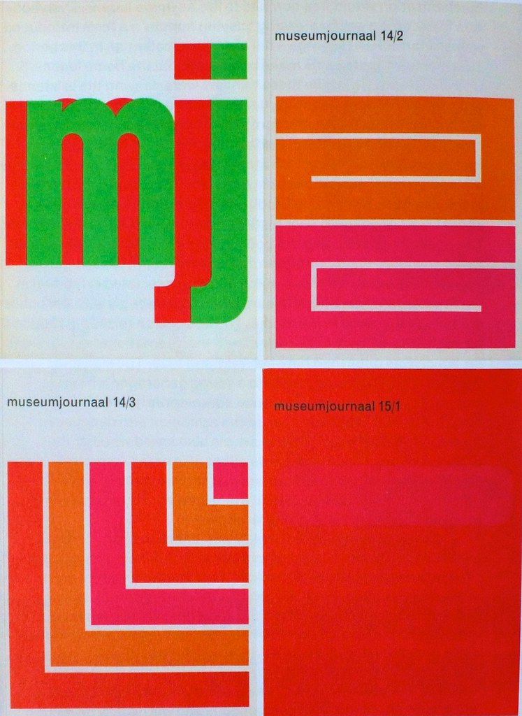
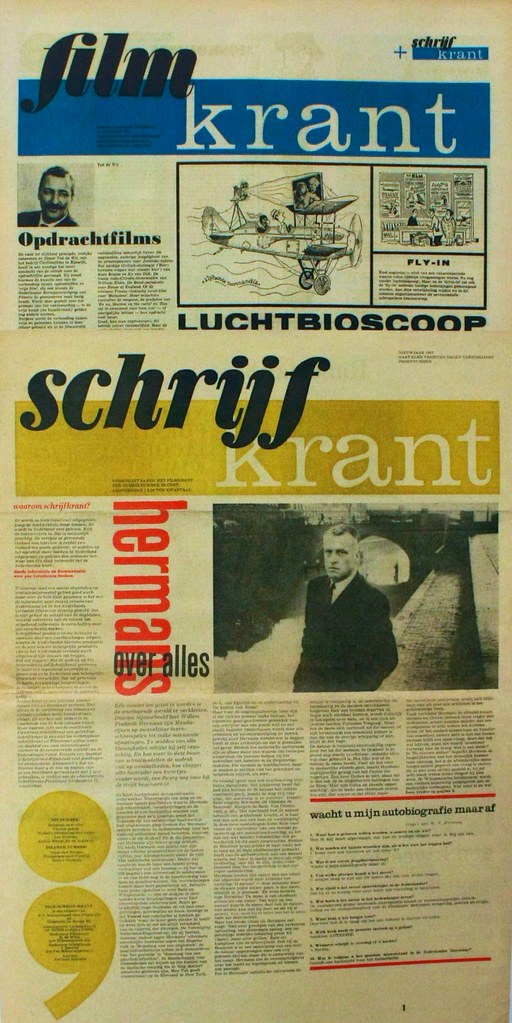
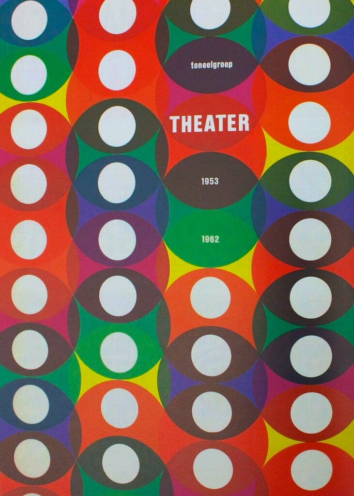
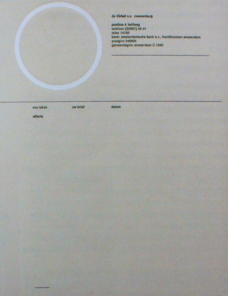
A few images from the Jurriaan Schrofer book reviewed in Eye 89. It's a great book. Well worth a look at.
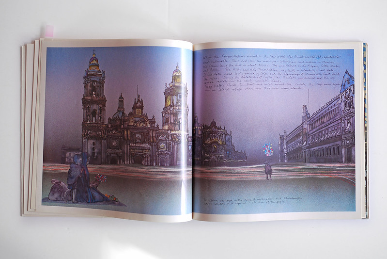
 The highlight of Eye 88 has to be Pegasus magazine; the Mobil publication running from 1970 – 1985, designed by Derek Birdsall. Read more here.
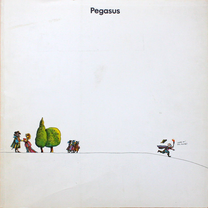 The combination of minimal layouts, large imagery and Michael Foreman imagery makes it a really interesting publication. Above is my favourite cover. I just don't think you could get away with that much white space in this day and age.